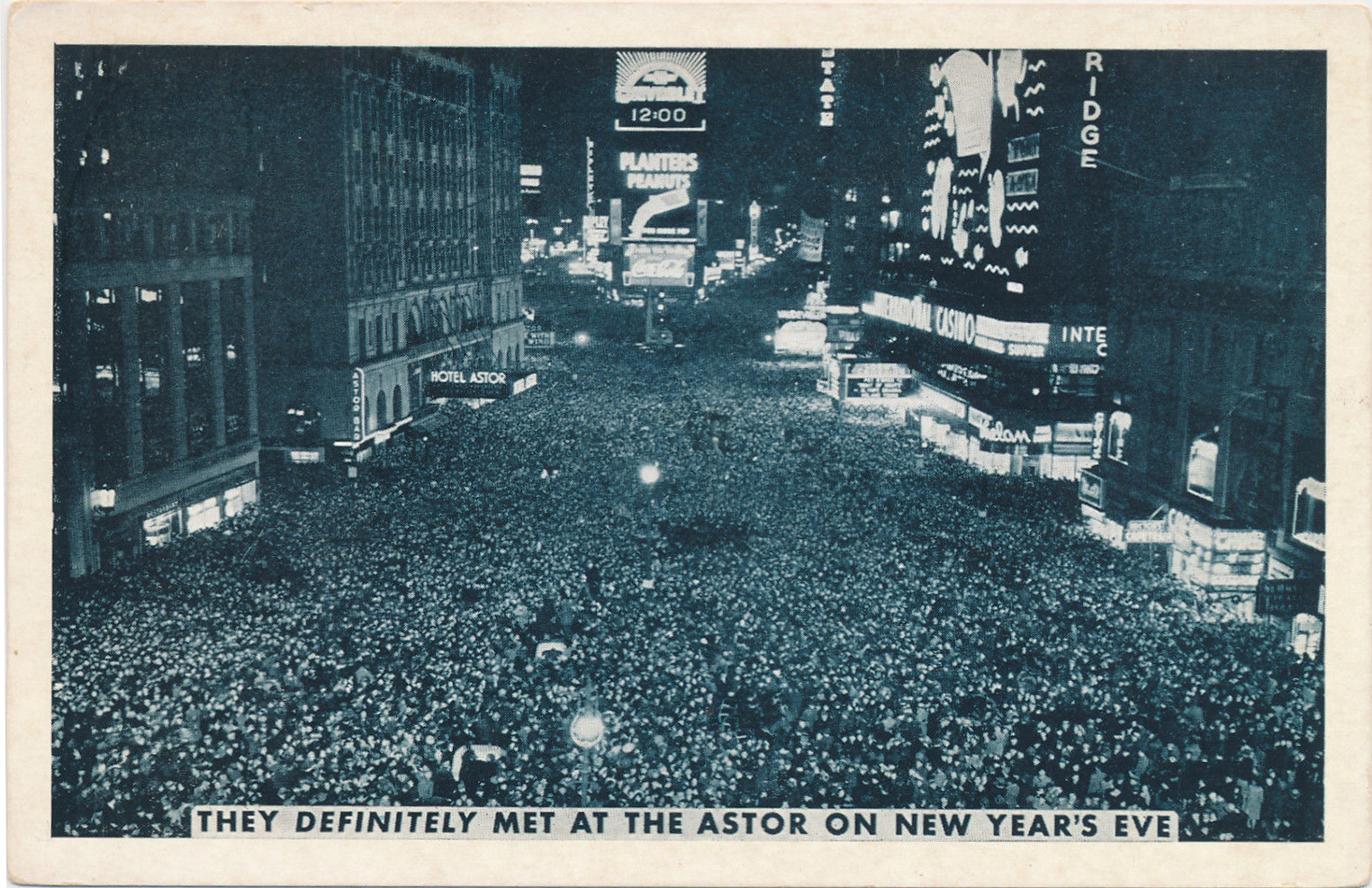
Vintage postcards celebrate New Year’s traditions

By Michael Perlman

mperlman@queensledger.com

Several decades ago, postcards were a unique work of art, which could be found at your corner pharmacy, but today vintage ones are found on eBay and at estate sales and postcard shows. They represent nearly every theme, including hometowns, hobbies and even New Year’s.

In 1873, the first American “picture postcard” was designed.

Today, a significant number of postcards from the late 19th and early to mid-20th century exist in an excellent state with fine penmanship and a one-cent stamp for domestic mail and two cents for international mail.

Deltiology is the collection and study of postcards, which derives from “deltion,” a Greek term for a writing tablet or letter. A postcard collector is known as a deltiologist.

Most New Year’s postcards are colorful lithographs that seem realistic, and a majority were published between 1898 and 1918.

Those from the 1920s to the 1940s were published in fewer quantities.

Some postcards offered a New York City theme.

One celebrated urban innovations and buildings that were regarded as landmarks.

A postcard recognizing the approach of 1906 features photos of significant landmarks; the Times Building, the New York City subway, the Flatiron Building and the Soldiers’ and Sailors’ Monument within large block letters of the year, was adorned with holly.

It was published by Franz Huld of 246 Fifth Avenue as part of Series 1906, No. 1.

He is regarded as a significant American publisher who experimented with views, commemorations, comics and novelties.

Earlier on, the postcard trade was largely based in Germany and Holland.

It is all eyes on Times Square in a selection of postcards. A white border postcard features a black and white printed image of shoulder to shoulder attendees.

It is captioned, “They definitely met at the Astor on New Year’s Eve.”

It was photographed from a once ornate Times Building and faces the Studebaker Building.

A Chevrolet illuminated sign reads 12:00. To its left is the legendary Beaux Arts style Hotel Astor, which was in operation from 1904 to 1967.

Times Square became the scene of New Year’s Eve celebrations in 1904, and the first ball drop dates to 1907, which was erected by New York Times publisher Adolph Ochs.

Other festive events were captured on hand-colored lithographs, including the Tournament of Roses on New Year’s Day in Pasadena, California.

It features an exquisitely decorated high school float with roses on trees, floats and vines that unite the unique costumed marchers.

Poetry and inspirational quotes can be found on early 20th century postcards.

A circa 1910 postcard features an illustration of an elegantly dressed woman holding flowers and sitting on a ladder, with flowers growing around the ladder.

It is titled “A Glad New Year” and reads in a creative font, “As you climb the ladder of success, With heart that’s kind and humble, You’ll surely reach the topmost rung, And never get a tumble.”

It becomes a musical production on an Auld Lang Syne postcard, which bids farewell to the old year and is interpreted as a call to remember long-standing friendships.

It features the complete lyrics on a banner with a watercolor background, and two men on top wearing suits with a top hat and a traditional hat, shaking hands.

Another New Year Greetings circa 1912 postcard reads: “We’ll take the Grand Tour round the sun, Nor mind the wind and wet, And may we say when it is done, ‘The happiest journey yet.’”

The poem is complemented by a child in a raincoat and a rain hat on a boat with a backdrop of an early skyline with blues and golds.

This signed postcard was the result of a significant American illustrator, Ellen Hattie Clapsaddle (1865 – 1934), whose style has drawn much admiration, making her a most prolific postcard and greeting card artist of her time.

Other postcards offer a romantic theme. Among a most elegant hand-colored lithograph depicts a couple dressed in an evening gown and suit and toasting in front of a picturesque scene of water, trees and a mountain while embracing on a landing in front of a mansion with a balustrade.

It is trimmed in gold leaf.

Another chromolithograph postcard from circa 1910 focuses on a Colonial era couple dancing at a ball, kicking their feet, with Impressionist musicians playing the violin and outlines of couples dancing in the background.

A gold frame with graceful ornamentation can be found within, where candlelight sconces are tied to the detail.

This embossed postcard was published by E. Nash Co. under the New Year Postcards Series, and was also a well-known illustrator of high-quality holiday cards and based in Manhattan.

A most famous publisher was Raphael Tuck & Sons, and the firm was considered “Art publishers to their majesties the king and queen.”

Postcards by this firm are most desirable and operated from 1866 to the 1960s in London and at 122 Fifth Avenue in Manhattan.

One postcard depicts an elegant couple ringing in the new year by looking into each other’s eyes as the man is pulling off a page of a calendar to reveal Jan. 1 under an elaborate Victorian style band with golden four-leaf clovers and under a Roman numeral clock.

Clocks that struck midnight were a popular theme, as in the case of an embossed gold, pink and blues accentuated 1907 postcard designed in the Art Nouveau style.

Some outstanding features were torches with ribbons, leaves and floral motifs.

A bottom inscription reads, “P. Sanders, New York,” which references the publisher. Illustrated holiday postcards were his specialty.

The advent of the automobile is celebrated in colorful postcards that were futuristic yet graceful.

A young couple, facing the camera, rides in a two-seater in “A Prosperous New Year” circa 1910 postcard.

The woman wears a traditional coat with a floral hat, beside a man in a well-appointed coat tipping his hat. The same couple was depicted in at least one variation of this postcard.

A deltiologist takes note of personalized features, including a ribbon and varied rose vines outlining the curves of the car. A young boy with angelic wings blows a triumphant horn in unison.

Prior to the postcard trade arriving in America, production was underway in Europe.

A “Buon Anno” circa 1900 Art Nouveau illustration features a woman pouring water from an urn to extinguish a fire, symbolizing renewal.

It bears the name of author R.M. Orlow. An inscription from publisher Stengel & Co (1885 – 1945) reads “Dresden u. Berlin.”

Real photo postcards, with color-tinted highlights of an image, were often dominated by a sepia tone finish.

It was rare to find the same couple or a group of children featured on other postcards of its kind.

These postcards usually offer an ornate ambiance and one-of-a-kind calligraphy, such as in a Bonne Année card, where a man looks into a woman’s eyes, ready for that New Year’s kiss.

The viewer can encounter timeless romance, and have a taste of Victorian era fashions and furnishings. Unlike completely illustrated postcards, these cards feature images of real people, often in a studio depicting a European setting.

Family bonds were represented on real photo postcards, and some featured calendars alongside portraits that reinforced those bonds year-round.

A baby boy hugs his father in one frame, whereas a baby girl hugs her mother in another.

A greeting, “May the New Year bring every happiness to you and yours,” can be seen daily while checking its 1911 calendar.

Gilded Age accented corners add to its distinction. This divided back postcard was part of the Rotary “Real Photographic” Opalette Series and was printed in England.

The Rotary Photographic Co. was associated with at least 1,422 portraits, was active between 1897 and 1916 and was a foremost real photo postcard publisher.

A hybrid of a romance and humor postcard can be found as a snowman takes on male and female form and engages in a proposal.

At midnight, a couple placed themselves in their shoes in a light-hearted interpretation in this circa 1920s or 1930s W.H.B. watercolor, which reads “Die besten wünsche zum jahreswechsel” or “Best wishes for the turn of the year” in German.

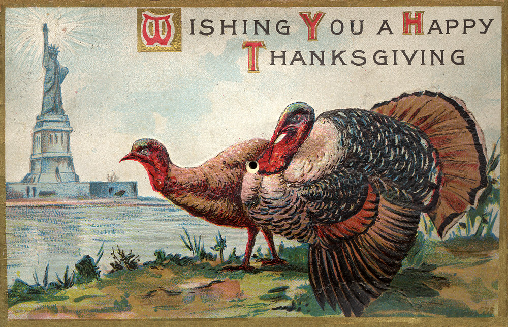
Celebrating traditions through vintage Thanksgiving postcards

Reviving forgotten postcard treasures

By Michael Perlman

mperlman@queensledger.com

An early 1900s gobble-producing mechanical postcard.

Historians consider the first Thanksgiving meal to date to 1621, where 53 Mayflower pilgrims and 90 Wampanoag Native Americans at Plymouth shared an autumn feast for a three-day period.

Thanksgiving traditions came to life through highly stylized and vibrant hand-colored lithograph postcards.

Today, they are considered to be collectible works of art.

In 1873, the first American picture postcard was designed.

A significant number of postcards of the late 19th and early to mid-20th century exist in good to excellent condition and feature handwritten messages and one-cent and two-cent stamps.

Deltiology is the collection and study of postcards, which derives from “deltion,” a Greek term for a writing tablet or letter. Therefore, a postcard collector is known as a deltiologist.

Several decades ago, postcards could be found at a corner pharmacy, but today they can be purchased at postcard shows and estate sales or on eBay. Amazingly, the topics represent nearly every theme imaginable, capturing the history of hometowns and hobbies to holidays.

As a deltiologist, it is timely to explore the artistry and history associated with Thanksgiving postcards by pinpointing highlights.

Mechanical postcards are most interactive and were cleverly engineered, which is why such postcards continue to operate approximately 120 years later.

In one postcard, a collector lightly presses the stomach of one of two elaborately illustrated turkeys, and it produces a “gobble.”

Steps away is the Hudson River with lustrous rays from the Statue of Liberty in the background. The application of color evokes the feeling of a watercolor painting.

The “Macy Color Views of New York” postcard series captures the magic of the Macy’s Thanksgiving Day Parade as of 1939, a year that is more recent than nearly all Thanksgiving postcards. This chrome postcard features a toy soldier float making its way alongside the Columbus Monument.

The 1939 Thanksgiving Parade, R.H. Macy & Co. series.

A caption reads, “Annual mile pageant of giant helium-filled balloons escorts Santa Claus to the world’s largest store at Broadway & 34th Street.” Since postcards are the catalyst for historic research, the viewer learns that the parade originated in 1924 and once featured animals from the Central Park Zoo.

Then floats were introduced and would be released into the air with a return address. If one was fortunate enough to find it after the parade ended, they would be a prize winner.

Some Thanksgiving postcards are embossed, adding an engaging feel to the realistic, yet dreamy hand-colored images, coupled with illustrations known as add-ons.

A divided back postcard from 1910 has “Thanksgiving Series Number 906” printed on the back, with the name A.S. Meeker, N.Y, granting insight on its publication.

It features a harvest theme with apples, grapes, corn, wheat and a pumpkin as part of a border formed by branches with Elm tree leaves.

It frames a river scene consisting of a rich autumn sky over a river with a farmhouse and a cow grazing. A turkey walks along the branches, overlooking the scene.

Other postcards in this series feature similar imagery and design details, hence telling a story.

A significant artist was Ellen Hattie Clapsaddle (1865 – 1934), whose style has drawn much admiration, making her the most prolific postcard and greeting card artist of her time.

In one of her signed postcards, children have big eyes on a pie after presumably baking it, considering their hats.

A product of the famed artist Ellen Clapsaddle.

The postcards offer a lesson within themselves when it comes to calligraphy, as each one is personalized.

Some of her postcards were accompanied by poetry: “Oh sing a song of pumpkin pies; And turkeys roasted brown; Thanksgiving Day is here again. And come this year to crown. Oh pray receive my wholesome wishes, For well-prepared Thanksgiving Dishes.”

This postcard was produced by International Art Publishing Company of New York and Philadelphia, as evident by a logo on the reverse featuring an eagle landing on a planet.

This subsidiary was founded by Wolf & Co. and Art Lithographic Publishing Co. to assume production of their souvenir and holiday postcards.

They were significant as a publisher of artist-signed cards and operated largely between 1895 and 1915.

Their firm was located at 3 and 5 Waverly Place in New York.

John Winsch (1865 – 1923) of Stapleton, New York was co-manager of the Art Lithographic Publishing Company.

He copyrighted his artist signed greeting cards, where many were published in sets, and produced approximately 4,000 designs between 1910 and 1915.

He was highly recognized for his Thanksgiving and Halloween postcards. He also used European artists who worked with his German printers.

His circa 1909 postcard, printed in Germany, consists of a black and white photographic window into nearly a few hundred years earlier, where pilgrims are preparing for their meal.

It is offset by a Victorian green, red and golden yellow color scheme, which dominates the large frame featuring ornate details, corn, a fall moon and triumphant instruments.

Some of Winsch’s cards feature poetry such as that of John Greenleaf Whittier (1807 – 1892).

An excerpt from his work, “Peace Autumn,” reads: “Thank God for rest, where none molest, And none can make afraid, for Peace that sits as Plenty’s guest, Beneath the homestead’s shade.”

Artist John Winsch & poet John Greenleaf Whittier: Significant art coming together.

He was noteworthy as an American Quaker poet, an advocate for abolishing slavery and a founder of “The Atlantic Monthly.”

His friends included Mark Twain and Frederick Douglass. His poetry reflected rural life, religion and nature.

The pilgrims’ arrival at Plymouth Rock was featured on a postcard by Raphael Tuck & Sons, where traditional colors, texture and emotions are brilliantly captured.

This firm was founded in London by Raphael Tuck (1821 – 1900) and operated from 1866 to 1959. Other locations included Paris, Berlin, Montreal, and 298 Broadway and 122 – 124 Fifth Avenue.

In 1894, his son, Adolph Tuck, created their first picture postcard.

Pilgrims’ arrival at Plymouth Rock by the significant firm, Raphael Tuck & Sons.

This prominent publisher was considered “Art publishers to their majesties the king and queen,” as noted on the reverse of their postcards, since Queen Victoria granted them the Royal Warrant of Appointment in 1883. These postcards are among the most desirable by collectors.

Certain postcards offer a lesson in patriotism, where at least one in the Gottschalk series exhibits a very rare 47-star American flag, symbolic of New Mexico’s addition in January 1912. The flag was active for only a month.

Victorian masterpiece, Gottschalk series with a rare 47-star American flag, 1912.

The colorful and highly stylized postcard series frequently says “Thanksgiving Greetings,” and this card also features an ornate gold embossed border, flowers and fruits marking a prosperous harvest, as well as a family of turkeys with teepees forming the backdrop.

Gottschalk, Dreyfuss & Davis Co. Ltd. was active from 1904 to 1915 and operated offices in New York, London and Munich.

Sometimes a menu was brought to the recipient; not always in the form of food, but a selection of blessings.

One such Gilded Age style postcard in this series features a pilgrim boy and girl, shoulder to shoulder, holding up graceful desserts, while a turkey, pumpkin and leaves add much character.

The entrée menu reads: “Health a la Wealth, Prosperity, Garnished with Joys, True Love, Happiness, Long Life.”

An E. Nash “Health a la Wealth” menu postcard.

Grapes are depicted on the menu as a symbol of abundance and good fortune.

This circa 1910 series was produced by New York publisher E. Nash.

Among the best Thanksgiving postcards highlights a Victorian-era family, ready for their cozy feast, marked by an elegant table setting under a gas lamp.

One artist brilliantly captured the anticipation between a husband and wife with a “Home Sweet Home” frame over the mantel, and a cat that is ready for the occasion, with a bowtie.

Embossed in gold leaf is “Welcome Thanksgiving Day.”

The design has a 1908 copyright by M.W. Taggart, a New York City-based firm from 1905 to 1910. Their specialty was holiday and greeting postcards with patriotic and humorous themes and a superb use of primary colors.

“Welcome Thanksgiving Day” by M.W. Taggart, 1908.

Many postcards feature handwritten messages, often with fine penmanship, either written with a fountain pen or in pencil.

It reads: “Dear Teacher, This card is from Carlie Strumguist. Wishing you a Happy Thanksgiving. Good bye.” The recipient is Frances C. Smith.

Over a century later, the spirit of past generations has its way of communicating.

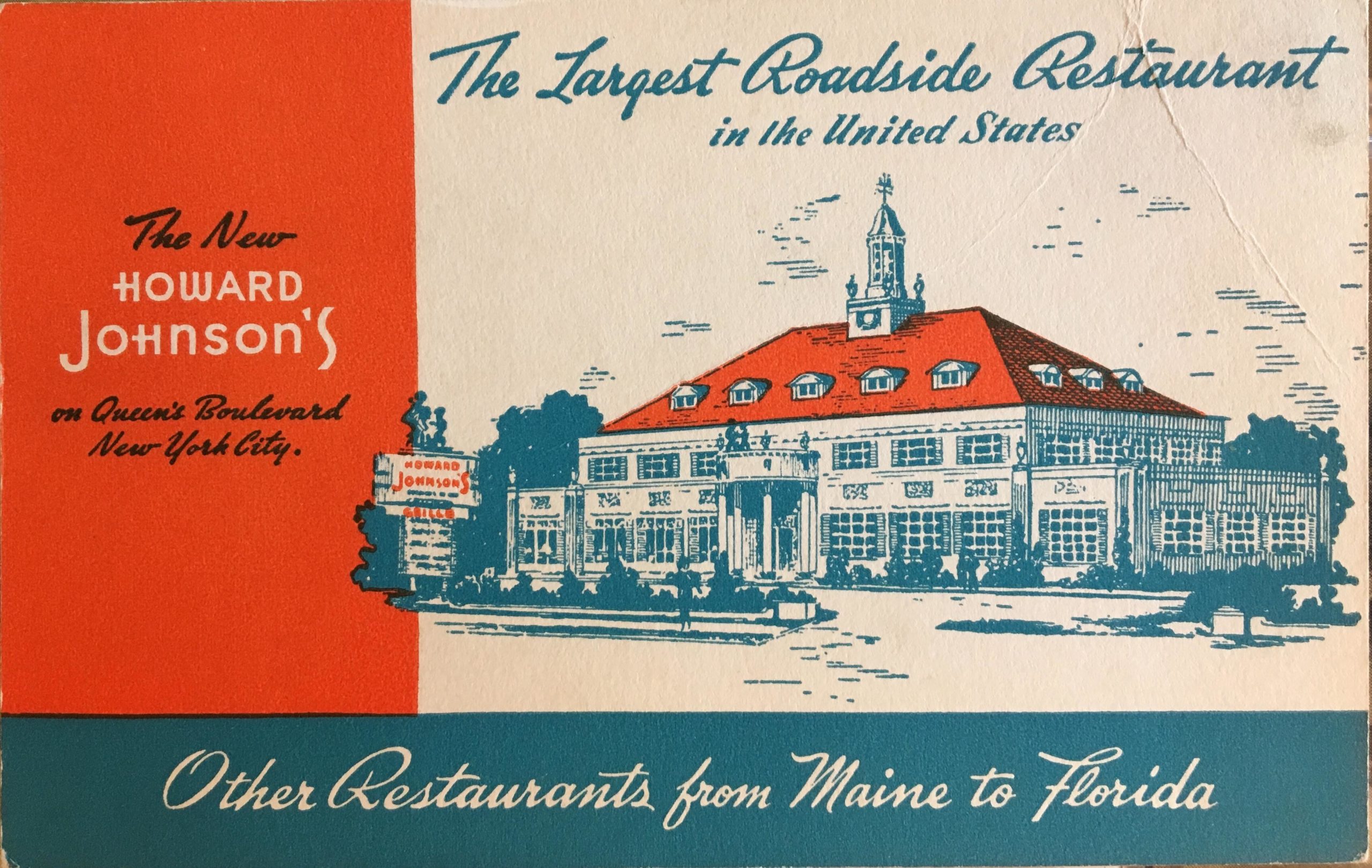
Perlman: Remembering restaurant favorites through vintage postcards

By Michael Perlman
mperlman@queensledger.com

There is a good chance that you mailed a postcard to family and friends, but may not realize that picture postcards date to 1893, and the majority, where a good percentage feature handwritten messages and vintage stamps, still exist. Deltiology is the collection and study of postcards, which derives from “deltion,” the Greek term for a writing tablet or letter. Therefore, a deltiologist references a postcard collector.

Forest Hills and Rego Park advertising postcards were once available for free at local restaurants, but today can sell anywhere from $10 to $50. Facades and interiors were often photographed from a unique perspective in postcards, complementing their architectural details and artistry, which extended a warm welcome to patrons.

Early 20th Century postcards featured black and white printed photos that were hand-colored and often seemed true to life. They were followed by linen-era color postcards beginning in the 1930s, followed by natural color chrome postcards as of the 1950s.

Mama Sorrento’s

A chrome postcard, published by Adchrome Pdts. Corp. of 509 Madison Ave., read, “To make dining out a real pleasure, be sure to visit Mama Sorrento’s.” Mama Sorrento, a most distinguished Italian restaurant and pizzeria, was situated at 107-02 Queens Blvd., along a retail strip completed in 1947, facing MacDonald Park.

Beyond a well-appointed Colonial façade, it featured cozy green booths, tables, and high ceilings, along with scenic artwork, a view of the kitchen, and a bar area. Deco green walls were offset by a brick wall. This popular restaurant served genuine Italian dishes that were recognized by patrons for their wonderful presentations. Accommodations were made for all social functions, and air-conditioning and free parking were additional attractions.


Joan Rizzi was a local legend, better known as “Mama Sorrento,” who would prepare traditional Neapolitan family dishes, making the restaurant a Queens favorite. She told The Long Island Star-Journal in May 1961, “cooking is an art in my family, and the policy that we have is to satisfy the people who come into our restaurant for the finest in Italian-American dishes.” One signature dish was Chicken Rollatini alla Parisienne.

This is also where actor, comedian, and voice-over artist Marty Ingels once had his signed headshot on display, likely prior to achieving stardom. This notable spot was a phone call away at Virginia 6-9277, where the postcard features a long-forgotten vintage prefix.

Tutto Bene Restaurant

Some postcards feature the evolution of restaurants—if you are fortunate enough to find them.

Such is the case with the chrome postcards of French Italian cuisine establishment Chez Pierre at 110-50 Queens Blvd., which opened around the early 1940s, and was later the site of Tutto Bene Restaurant, an Italian classic cuisine spot, circa the late 1960s. Both restaurants featured elegant murals, which were a mainstay of restaurants that made patrons feel as if they were on a getaway for the evening.

Checkered tablecloths in one restaurant, eventually made their way to double red and white tablecloths in another, hence the eras. The latter business featured warm wood-paneled walls and elegantly framed artwork, with small ornate chandeliers. “Tutto Bene” translates as “everything good,” and among the patron favorites were Lobster Fra Diavolo and Assortimento Tutto Bene.


La Stella

Several Italian restaurants were documented in postcards. La Stella, under the management of “The Taliercio Bros.” Joseph and Jack, was at 102-11 Queens Boulevard and featured fine Italian cuisine, wine, and liquors.

The chrome postcard displays its ambiance, consisting of orange walls, high ceilings, chandeliers and sconces, traditional Italian picture frames, and white tablecloths. The zig-zag patterned floor added much character. The angular art deco storefront featured classic illuminated script signage.

Aside from its popular menu, this is the site of the notorious September 1966 luncheon that resulted in the arrest of 13 top members of organized crime, which The New York Times called “Little Apalachin.”

Another chrome postcard featured Monte’s, a fine Italian restaurant and pizzeria at 71-51 Yellowstone Blvd. It offered home delivery and parking in the rear and was advertised as being 3 blocks from Parker Towers.

Monte’s

Looking into the restaurant, a curtained window made it resemble a showroom, and tall candles with ornate holders in each booth added to its elegance. A recessed ceiling with a chandelier, a checkered floor, and an Italian wall sketch also contributed to its mood. This restaurant would later become the cherished Da’ Silvana.

A linen postcard features the Ideal Spot on Burns Street and Yellowstone Boulevard, where patrons would “dine and dance in comfort” near a bandshell where there was “always a cool breeze” under the trees. It also featured a beer garden at 66-20 Thornton Pl., and an early ad read, “a hard place to find, but worth the effort.”

In April 1938, a license was issued to the Ideal Spot to sell beer, wine, and liquor. Living up to its name, patrons would sit at tables with checkered tablecloths under a tree canopy of Maples, where they could be acquainted with nature and keep cool under a starlit summer’s night. Open year-round, patrons could also dine and dance nightly, and games were coordinated.

Community functions included the Kew-Forest Kennel Club’s all-breed match show in 1938 and the Annual Dinner Dance and Revue of the Forest Hills Homeowners Association in January 1942.

The Ideal Spot

The jazz scene consisted of regulars Art Hodes on piano, Rod Cless on clarinet, and Joe Grausso on drums. Bill Reid’s Dixieland Band also took the stage. In 1940, patrons welcomed a new air-cooled room, where the seating capacity increased to 500, with an extra-large indoor dancefloor.


In its early days of operation, the family business consisted of Terry, Anne, Ernie, and Pop Nuerge, who helped define the neighborhood’s culture.

Patrons often walked or took their cars to the Ideal Spot, but during World War II, the clientele began to decrease due to gas rationing and the ban on pleasure driving. Thanks to the creative management in 1943, patrons rode safely in a covered wagon, which would meet at the subway stop every hour on the hour and depart from the Ideal Spot at half-hour intervals.

The tree bark-inspired menu consisted of a canapé of anchovies or a fruit cocktail for 25 cents and Soup du Jour for 20 cents. “Blue plates a L’Ideal” offered choices such as a sirloin steak for $1.25. For a quarter, patrons could order a cold sandwich of Limburger cheese or liverwurst, and for 50 cents, order a caviar sandwich. The Ideal Spot closed in 1962, and then the property accommodated a series of Yeshivas.

Topsy’s

Topsy’s Cabin Fried Chicken, also known as Topsy’s Chicken, a southern-style culinary landmark that also served corn fritters among its most popular options, opened in 1937 in a one-story Colonial building at 112-01 Queens Blvd. in Forest Hills, which later became a two-story Colonial building. The Topsy’s façade was initially depicted in a linen-era postcard.

The Topsy’s slogan was “Eat It With Your Fingers.” A Topsy’s billboard once caught the eye of community residents and read “m-m-m one block ahead” and also stated “famous for chicken,” with a tempting plate. Examining postcards, often makes one conduct further research. In this case, it was replaced by Seymour Kaye’s in 1971, which specialized in Jewish dining. In 1989, the site became The Pinnacle, as we know it.

Diners once dotted the tri-state area. One can see from a George Hollis Diner linen Colourpicture postcard a classic example of art deco, which was a highlight of many sites, thanks to the influence of the nearby 1939 World’s Fair in Flushing Meadows. Mr. Hollis was at your service at this freestanding railway car-inspired diner, which was in existence potentially into the late 1950s. It featured striking curved corners of glass blocks and sleek horizontal and vertical details.

The George Hollis Diner

It was located at 109-23 World’s Fair Blvd., which was temporarily renamed Horace Harding Boulevard, and was near 108th Street. The postcard read, “In the Shadow of the World’s Fair” and “dine here and enjoy the finest food in a rare atmosphere of beauty and distinction. Counter and booth service. Always open.” Numerous fairgoers’ palates were enticed! The Fair’s symbolic spire-like Trylon monument was evident in its path.


Rego Park postcards are a novelty since far fewer views exist than Forest Hills postcards. One features a colorful sketch of Howard Johnson’s at 95-25 Queens Blvd., which was advertised as “the largest roadside restaurant in the United States,” coincided with the 1939 World’s Fair and won first prize from the Queens Chamber of Commerce.

It sat 1,000 patrons. The Georgian Colonial mansion-like façade featured sculptures, ornamental cast stone, pilasters, a portico, dormers, shutters, and terraces, and was topped off with a cupola. A freestanding art deco sign boasted 28 ice cream flavors such as chocolate chip and burgundy cherry ice cream, as well as a grille and cocktail lounge. Weddings were held in the “Colonial Room” and “Empire Room.”

Regal appointments included crystal chandeliers, a winding grand staircase, and murals by the famed Andre Durenceau. The 1939 World’s Fair’s esteemed seafood chef Pierre Franey was on-site. It is also where chef Jacques Pépin worked and was later the recipient of an Emmy Award for Lifetime Achievement. In 1974, this unofficial landmark was demolished, but it is forever etched in the heart of many New Yorkers.

Vintage postcards celebrate Thanksgivings past

In 1873, the first American postcard was designed. Today, a significant number of postcards from the late 19th and early 20th century exist in an excellent state.
Deltiology is the collection and study of postcards. Deltiologists find vintage postcards on eBay, at estate sales, and postcard shows. Themes include hometowns, hobbies, and holidays. This week, I’m sharing some highlights from my personal collection.
Most Thanksgiving postcards are colorful lithographs. A majority were created between 1898 and 1918 and are now collectible works of art.
Ellen Hattie Clapsaddle (186 –1934) was one of the most prolific postcard artists of her era. One of her signed postcards features a pilgrim woman baking a pie in her kitchen and reads “Busy hands make a happy heart, May Health and Wealth their share impart.”
John Winsch of Stapleton, New York, was co-manager of Art Lithographic Publishing Company. He copyrighted his artist-signed greeting cards, which were often published in sets. He produced approximately 4,000 designs between 1910 and 1915, and was highly regarded for his Thanksgiving and Halloween postcards.
Other notable postcard producers included Alcan Moss Publishing Company of Manhattan, which produced the National Bird Series, and Whitney in Worcester, Massachusetts.

Fill the Form for Events, Advertisement or Business Listing